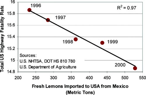
Statistical Biases You Probably Face (and How to Avoid Them)
Statistics mislead us when we fail to interpret our data correctly. Let's explore some common statistical biases and learn how to overcome them.
Humans have a natural tendency to make sense of the world. We gather information, connect the dots, and reach a conclusion. Since we have data, we become increasingly confident in our conclusions.
That confidence becomes a curse when we interpret data incorrectly. It makes us cling to an false understanding of the world. Such a phenomenon is known as a statistical bias. For statistical biases, the data or observations you collect is legitimate. But the way you interpret that data is misleading.
In the following paragraphs, I present my favorite statistical biases in plain English and explain how avoid being mislead by them.
Gambler's Fallacy 🎰
Survivorship Bias 🔪
Influential Observations 🦖
Data Dredging 🗂️
Simpson's Paradox 🍩
Gambler's Fallacy 🎰
Suppose you're flipping coins with a friend. The two of you agree on a dollar amount to bet. If the coin lands on heads, your friend pays you the money. If it lands on tails, you need to pay your friend.
After few coin tosses, you notice that you've lost five times in a row. Red with frustration, you decide to bet the remainder of your money. You've already lost five times in a row. The next coin toss must go differently, right?
As you walk home in shame with no money left in your pockets, you realize that you've fallen victim to the gambler's fallacy. Those affected by the gambler's fallacy believe that past events always influence future probabilities.
Independence in Probability
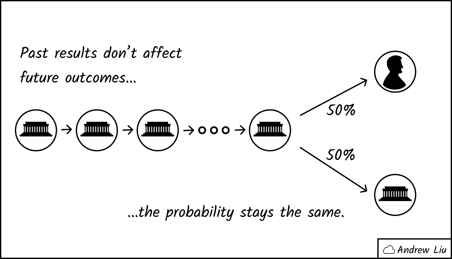
Situations like multiple coin tosses are known as independent events. The results of a toss does not affect what happens in any future tosses. Other common independent events include poker hands and dice rolls.
When you flipped a coin for the first time, the probability it would land on heads was 50%. After your losing streak, the probability is still 50%. It may feel like you should be winning a bit more in order to "even out" the wins and losses. But the truth is that future events don't care about what how past events turned out.
(Note that if you kept flipping coins infinitely, you might expect the ratio of heads and tails to converge to a 50-50 split. However that's due to a high sample size and the law of large numbers. Past results don't matter.)
Fixing the Gambler's Fallacy
I would tell you to stop gambling, but that would be no fun. Instead, a simple mindset shift can help you overcome the gambler's fallacy:
When you make decisions based on independent events, forget what happened in the past.
Treat each coin flip as if it were your first. If you're in a losing streak or a winning streak, pretend nothing ever happened. That way, the results of the past will not mislead you.
Survivorship Bias 🔪
During World War II, the United States wanted to reduce the number of bomber planes it lost to enemy fire. As a result, researchers surveyed the locations of bullet holes from planes returning from their missions.
The researchers hypothesized that sections of the plane which received the most damage deserved additional armor. Seems reasonable. As planes returned from their missions, the researchers recorded the bullet hole locations. Their overall data looked something like the diagram below:
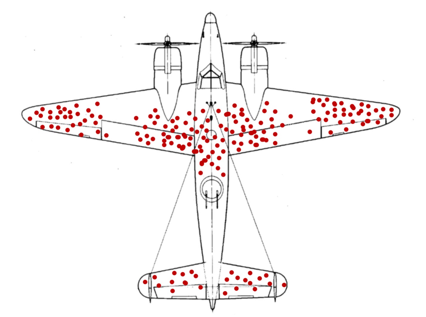
From the diagram, one could conclude that the wing tips deserve more armor. After all, those sections received the most damage. But take a step back. What happened to the planes that didn't return from their missions? Where were they shot?
If we think critically about our dataset, it's apparent that a plane becomes a data point only if it doesn't get shot down. The data doesn't show any planes with bullet holes in the engines or cockpits. Was that because bullets magically avoid those areas? Perhaps those planes never made it home.
If we account for planes that were successfully shot down, the bullet holes from the surviving planes actually indicate the sections of the plane that are not important to protect. Our sample does not represent all of the planes.
Survivorship bias occurs when certain properties of a data point may prevent it from becoming part of the dataset. We mistakenly focus on the properties of the "surviving" data points. That's why we see bullet holes in the wings of planes, while planes shot in the engine never make it home. It's also why it seems like all hedge funds make a lot of money and college dropouts tend to become billionaires. The ones who don't are not part of the statistic.
Surviving Survivorship Bias
You can detect survivorship bias by asking yourself one simple question:
If my conclusion were wrong, would I be able to notice?
If your answer to the question is no, then you may be experiencing survivorship bias. If a lottery winner shares his strategy with you, think about what would have happened if the strategy were bad. For every winner, there may be millions of losers who did the exact same thing.
On an abstract level, pay attention to whether your observations affect the data you receive. If you want to learn about the lottery, sample everybody who buys tickets, not just the winners. Every lottery winner purchased a ticket, but not all ticket buyers won the lottery.
Influential Observations 🦖
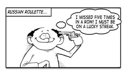
On average, most people who play Russian roulette survive and make money. Yet despite such good average returns, I advise against playing Russian roulette.
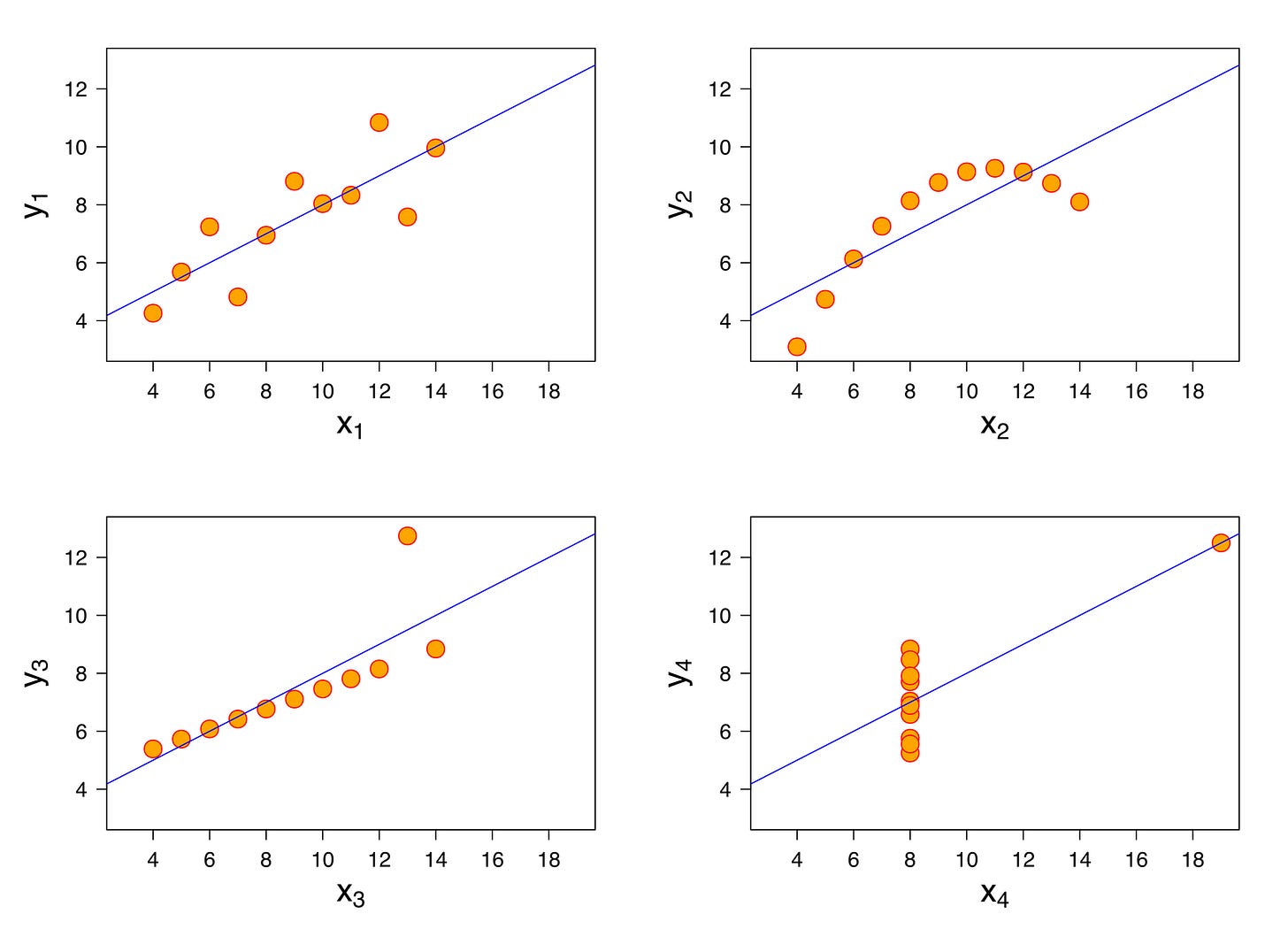
We have a tendency to generalize from aggregate measures (such as averages). The problem is that aggregates don't tell the whole story about the data. If we only knew the average results of Russian roulette, it would seem like a reasonable game to play. However, seeing that people can die from the game is an influential observation. As we learn more, the averages lose value, and our conclusions change.
Looking at the distribution of a dataset fills in the blind spots of aggregate measures. For example, averages don't matter for startup valuations. Most startups are worth nothing while others are worth billions of dollars. The average tells us nothing. If we observed the popularity of books, we would find that a few of books account for the majority of all book sales. In the same vein, the average doesn't help much. Unless the distribution of data is simple, averages only give us a limited view of the world.
Inspecting Influential Observations
The moral of the story around influential observations is that you always need both sides of a story. That's why statisticians tend to make calculations and visualize data as well. It's all a means to an end in order to understand the data.
Be cautious of calculations presented in a vacuum. Seek to gather more context and understand your data.
I don't mean to suggest that averages and aggregates are misleading. Instead, think of them more like a pieces of a puzzle in a world full of blind spots.

Data Dredging 🗂️
Data dredging involves hunting for statistically significant patterns in data. (Some readers may also know this term as p-hacking.) It doesn't matter whether pattern is a false positive or not; the goal is to force out an "insight." Therefore, those who practice data dredging may abuse the following tactics:
Exhaustively measuring random combinations of variables in a dataset
Discarding and retaking samples of data
Selectively reporting results with statistical significance
In simple terms, data dredging is the act of presenting something that was statistically significant by pure chance.
You may be wondering if data dredging only works in obscure cases. Unfortunately not. If a dataset contains enough variables, the probability that there won't be any false positive patterns is low.
Suppose a large sugary snack company funds research to prove that sugary snacks are healthy. The data they collect suggests that the snacks are (obviously) unhealthy. In response, the researchers toy with the data in hopes of discovering any pattern that suggests otherwise. When publishing the research, they only present the sliver of evidence "demonstrating" that snacks are healthy. This is how data dredging happens in the real world. Some have a vested interest in reaching a given conclusion, even if that means grasping at straws.
Detecting Data Dredging
To determine whether data dredging occurred, question the researcher's methodology.
Were the measurements determined before data collection?
Are the results reproducible?
Do the conclusions make sense?
Answering no to any of these questions may indicate data dredging. If researchers don't plan out their measurements before data collection, they may have hunted for false positives. If results aren't reproducible, the conclusions may only exist by coincidence. If the conclusions don't make sense, it may also indicate some form of tampering.
Simpson's Paradox 🍩
In 1973, the University of California Berkeley was sued for gender discrimination. It seemed that its graduate school admitted females at a lower rate. The graduate program accepted 44% of the 8442 men who applied. Meanwhile, it only accepted 35% of the 4321 female applicants. How sexist!
A study of the admissions data attempted to understand why the discrimination happened. It broke down the admissions numbers by department and reevaluated the data. The chart broken down with the six most populous departments is below.
In general, most of the 85 departments seemed fair. However, the research determined that 6 departments had biases against men. Meanwhile, 4 other departments were biased against women. When accounting for departments, the school as a whole was more biased against men. How sexist!
The conclusion we draw from the paper is that the specific department matters. Women tended to apply to more competitive departments with lower admissions rates. In contrast, men tended to apply to departments that were less competitive.
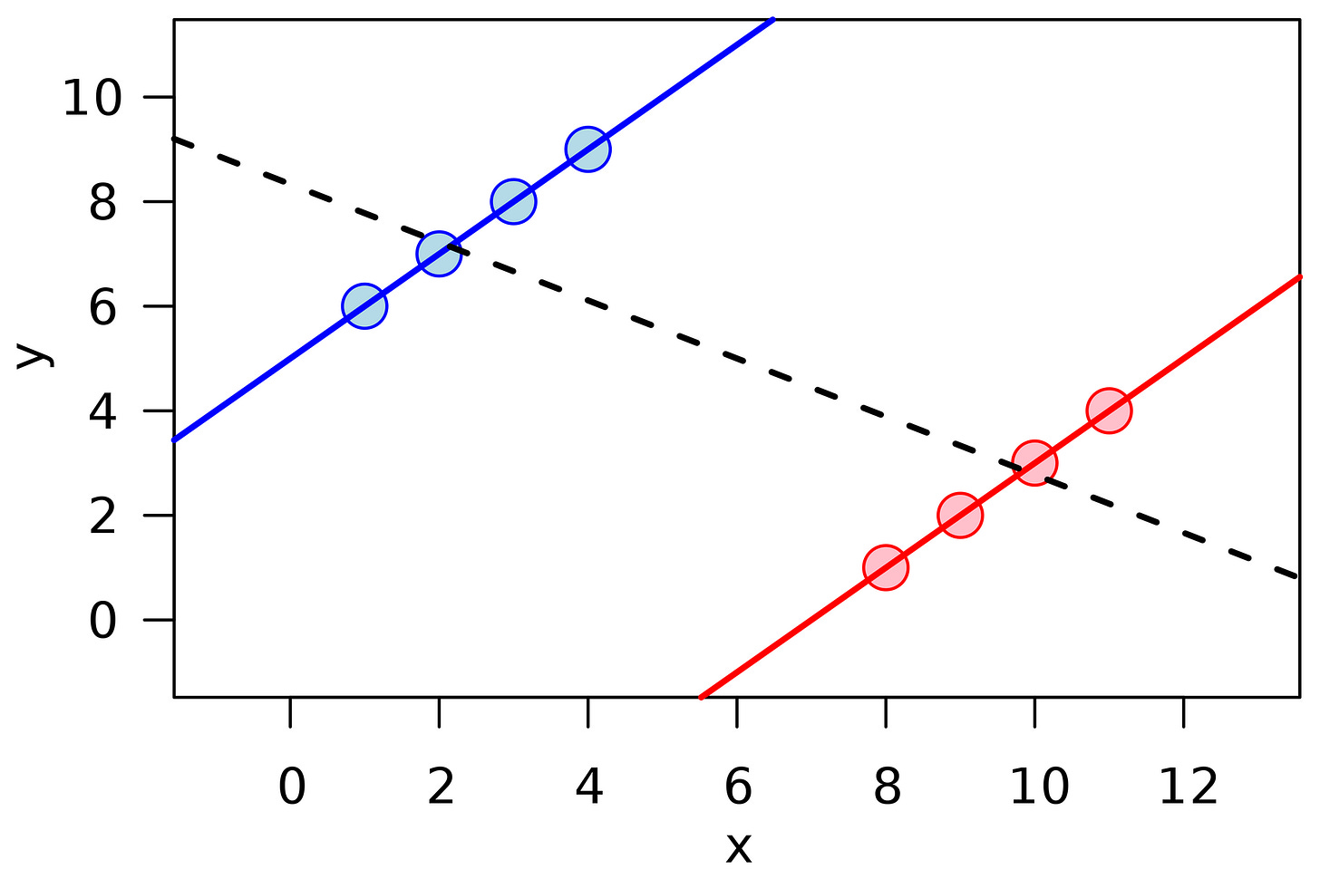
The whole admissions confusion is a classic example of Simpson's paradox. There's a clear trend among a population, but that population is broken into groups, the trend either disappears or reverses.
If you think about it intuitively, a few factors contribute to this paradox. First off, population sizes among groups tend to be disparate. That can throw off averages. Additionally we can miss confounding variables that actually determine our results. The important variables get drowned out by skewed sample sizes.
Solving Simpson's Paradox
Reacting to Simpson's paradox is two-step process. You'll need to take the following actions:
Detect situations where Simpson's paradox may exist
Determine which interpretation in Simpson's paradox is correct
Simpson's paradox may exist if you notice unusual patterns that look like generalizations. Look for hidden variables that may explain the pattern. If accounting for that variable actually matters, it's an instance of Simpson's paradox.
The next step is to determine which trend aligns with reality. Note that splitting a population into group isn't always correct. You'll have to use critical thinking in this case. With college admissions, it made sense that the department impacts the admissions rate.
Suppose you had observed the hair color of applicants instead and found a new trend. You should be skeptical that hair color is a true confounding variable. It doesn't make sense that hair color affects admission rates. (Pursuing a correlation between hair color and admissions would actually be data dredging!)
Closing Thoughts
At the risk of being admonished by my more math-oriented friends, I want to share my "street smart" version of the core principles of statistics:
Numbers are hard.
People can get fooled by statistics.
You don't want to be a sucker.
Statistical biases encapsulate all three principles. At the end of the day, it's important to have a clear understanding of reality. For that, you must know how to properly interpret what you observe. Keep a clear head, and you'll be hard to fool. Have fun!


